Hunter's Moon
2025
The latest project from Zugalu.
I worked as the UX/UI Designer on this 6-month project to rework the entire interface. My duties included:
- • Design and implementation of UX/UI.
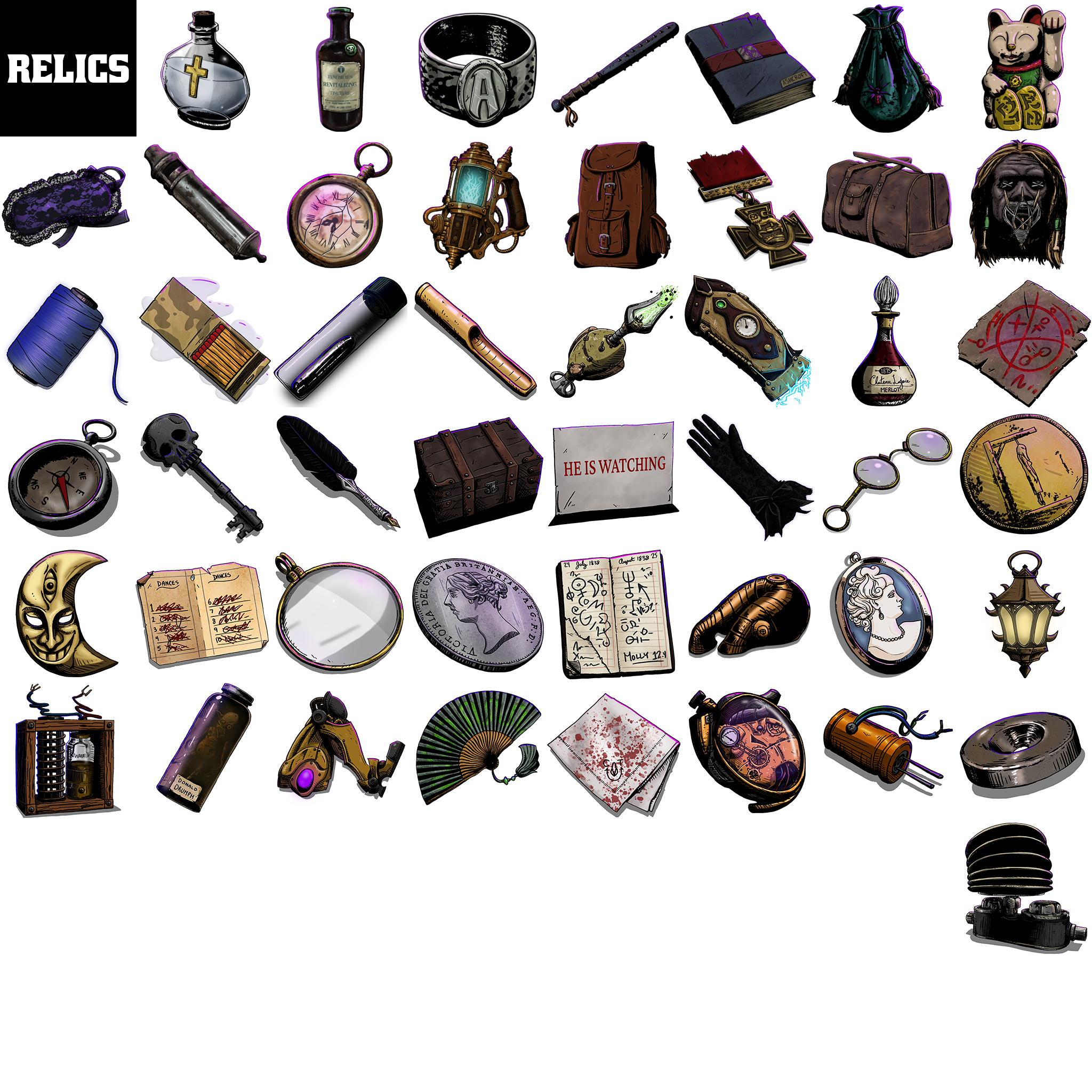
- • Produced digital art for icons, consumables and relic art for over 100+ items.
Lead Level Designer / UX UI Designer
- • Design and implement the game UX/UI.
- • Worked collaboratively with the Creative Director, art and design teams to meet milestone requirements.
- • Determined UX/UI flows, interaction feedback, audio and visual effect requirements to provide rich player experiences.
- • Produced digital art for icons, consumables and relic art for over 100+ items.
- • C# programming where required.
Design for Hunter's Moon
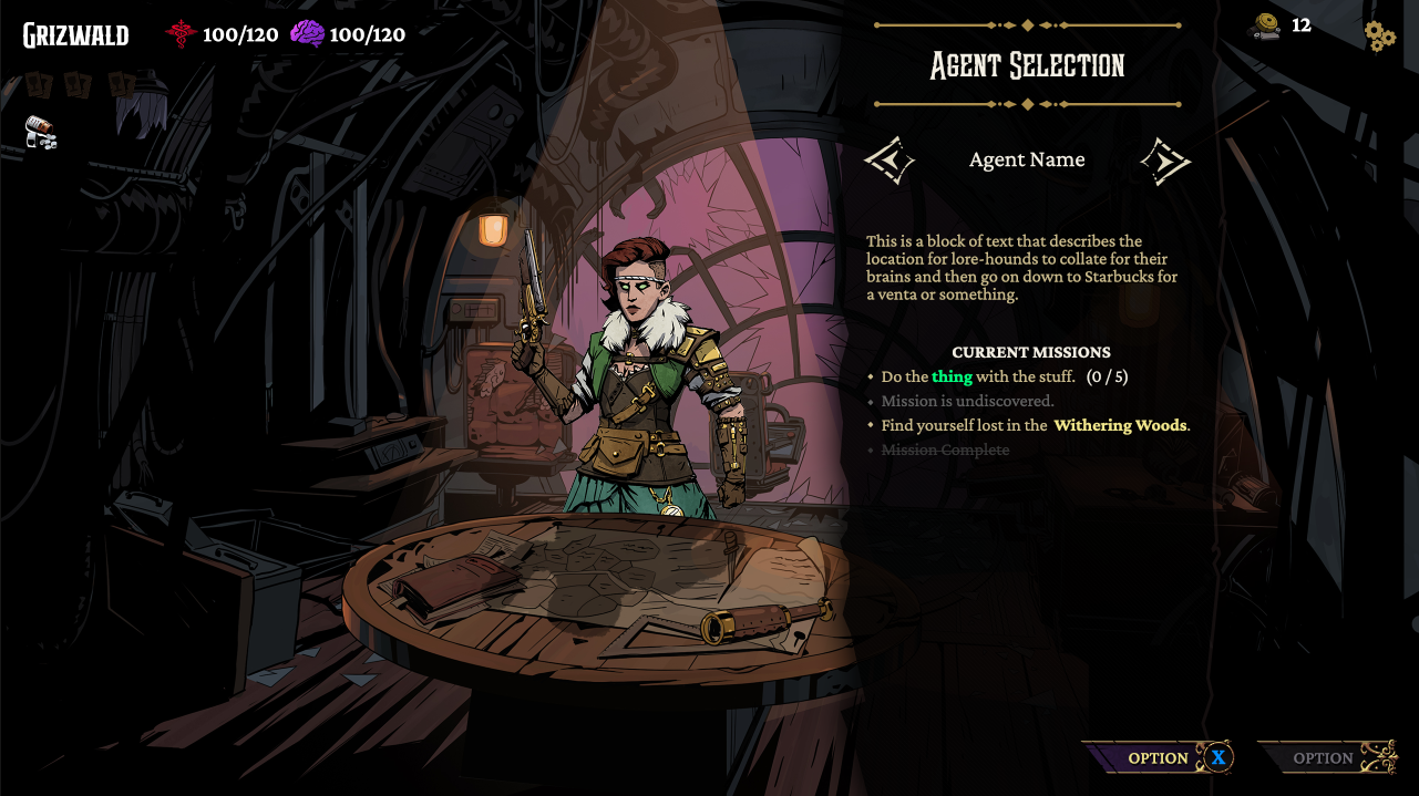
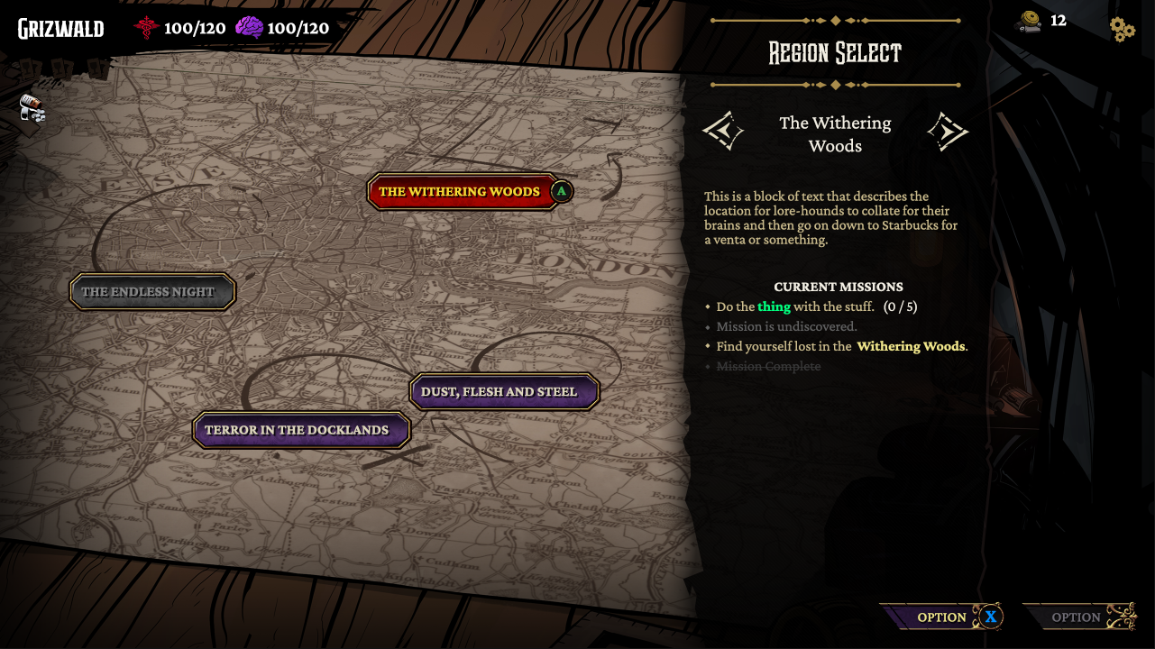
A deckbuilder with a focus on rich narrative and story elements over fail-and-repeat gameplay, Hunter's Moon provides something different in the genre. The Art Director had a very particular art style that needed to be emulated across the entire UI to provide a cohesive theme and mood, and the result is a steampunk adventure with a unique approach to the genre.
There were significant constraints on this project from the start: We only had 6 months to get this done, we were using an existing codebase we had purchased the rights to, and we did not have the time or manpower to make significant alterations to the UX/UI flow. This meant sacrifices were necessary to meet deadlines and milestone goals.
We would keep the visual design largely minimal and use few colors, matching the art style and theming of the amazing assets being designed by the art team - and take a risky gamble in replacing the core UI code with a custom system designed in-house by Zugalu to allow us to do what we wanted with interaction animations and narrative.
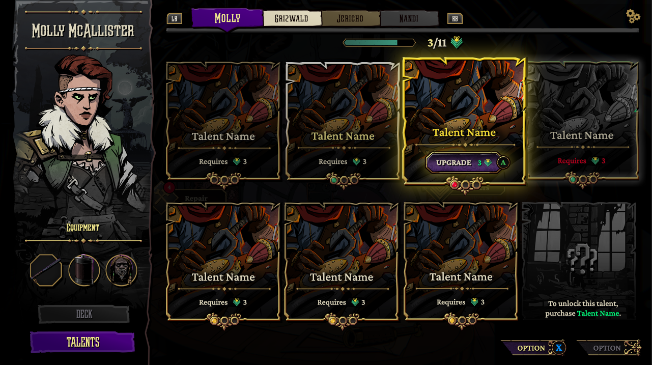
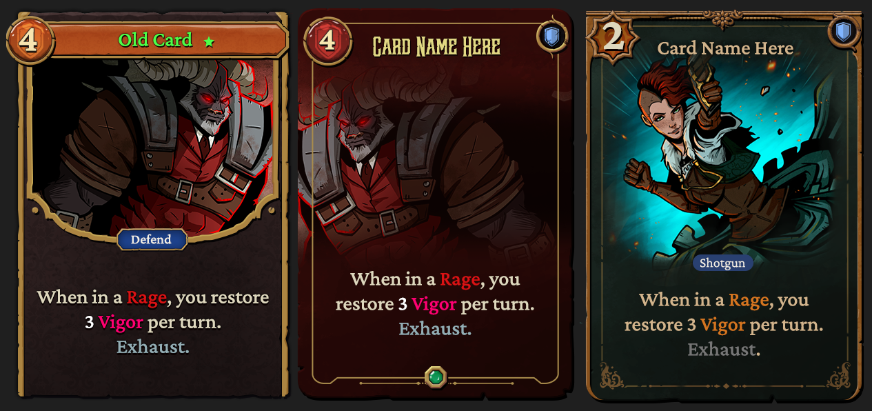
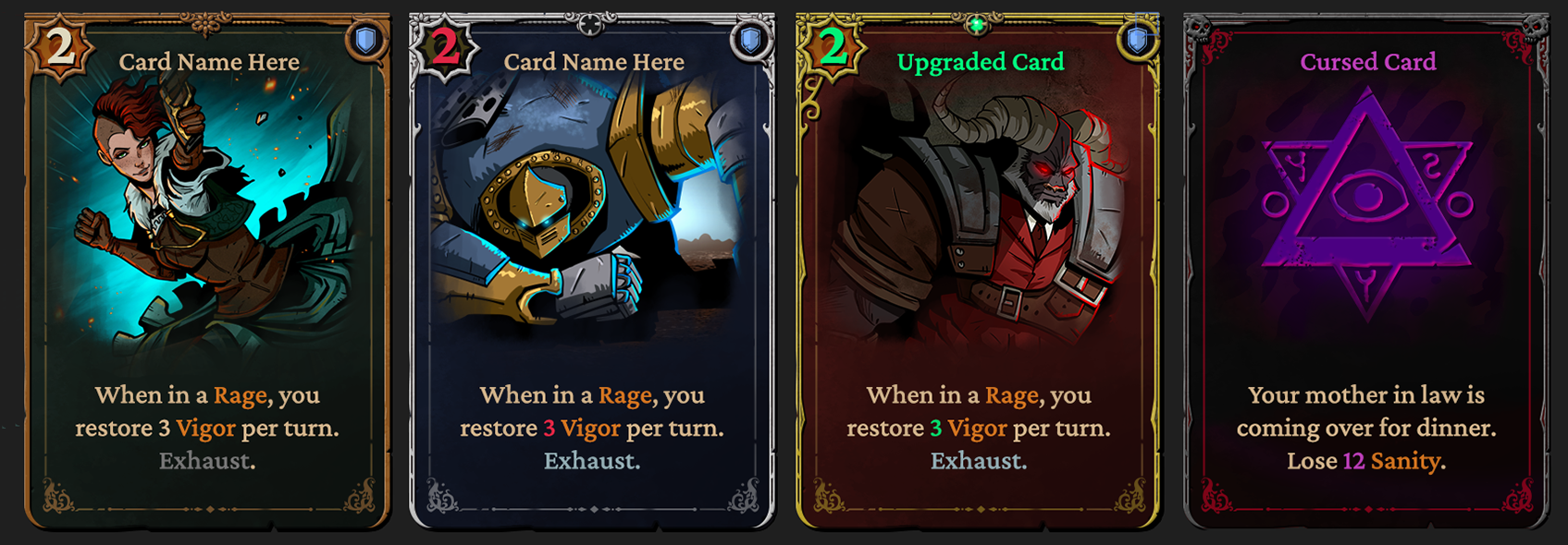
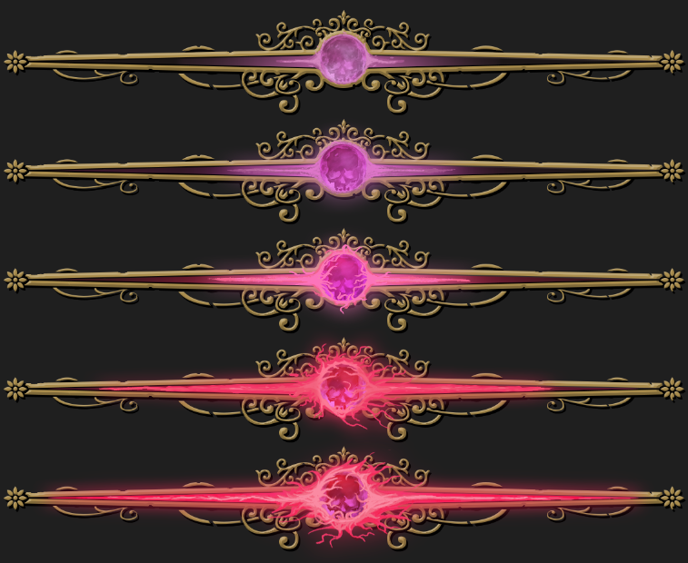
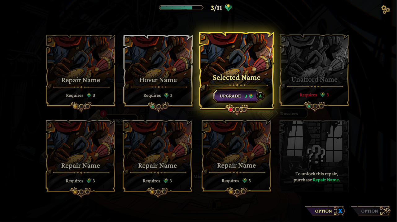
Card Redesign
Unhappy with the state of the default Menace from the Deep cards (they felt cramped and flat and did not use nearly enough screen space!) I intended to make significant changes to this element of gameplay - they were arguably the most important element and were absolutely essential to get right.
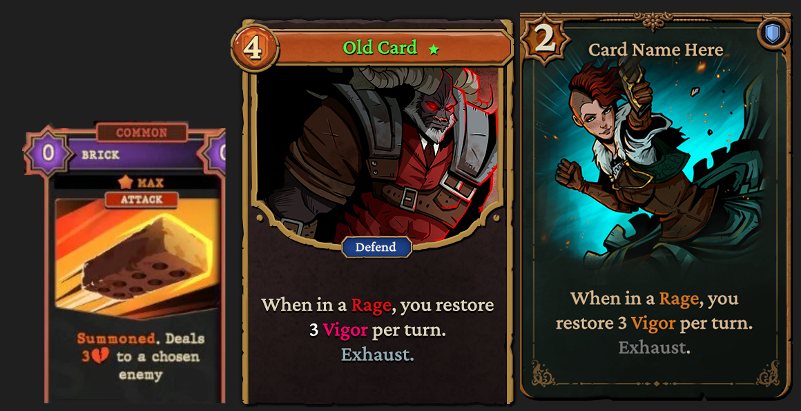
(left) Original Menace from the Deep card. (center) The first iteration for Hunters Moon cards. (right) The final card iteration.
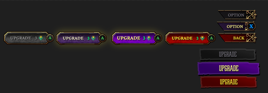
The following changes and decisions were made in regards to card design:
• Significantly increased card size to provide more padding for content and additional space for text.
• Remove the pointless 'type' text pillbox in place of an easily read icon in the top right.
• Increased font size from 18-20px to 24-36px to improve readability for accessibility and smaller resolutions.
• Reduce cognitive load by showing fewer text colors.
• Match a victorian-steampunk feel, with comic influence.
• Provide additional space for artwork to be displayed.
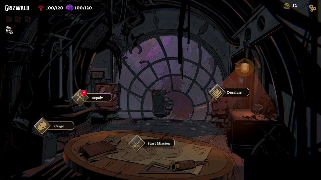
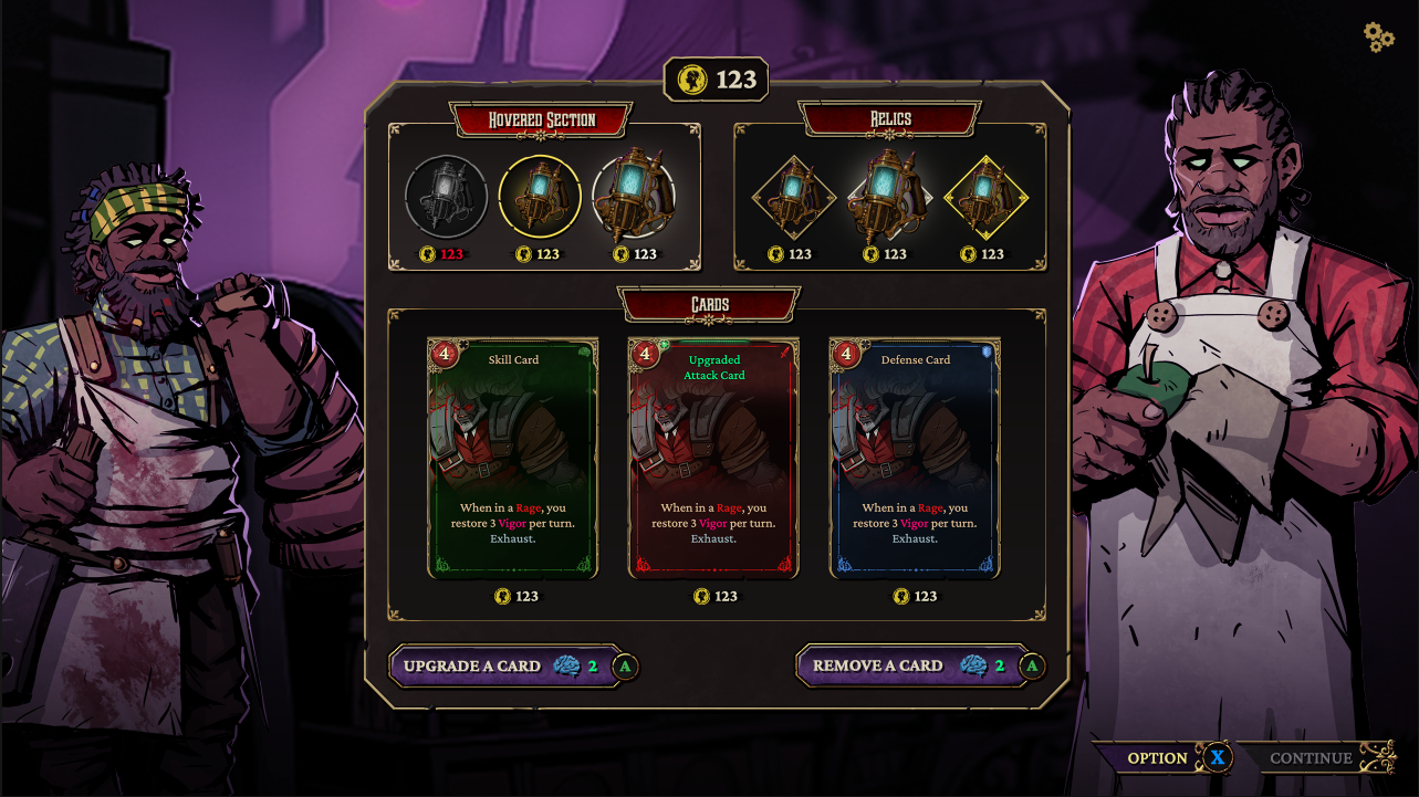
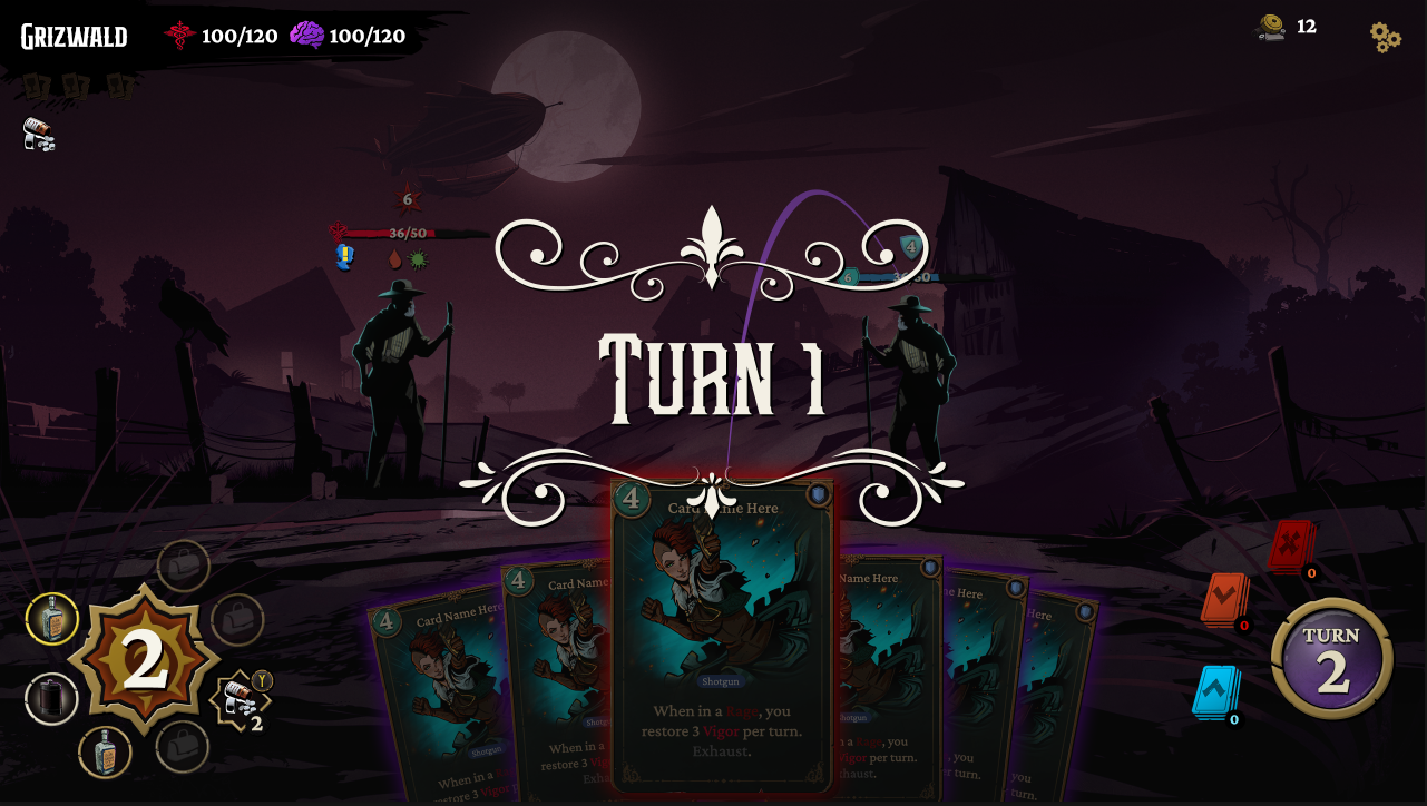
The Battle Screen
As the vast majority of the game takes place within the confines of this interface, it was essential to get everything on this screen just right. Menace From The Deep had hit most of the necessary milestones - but there were usability concerns and odd stylistic choices that had to be rectified to suit our new design.
Users expect a certain experience in a deckbuilder interface, and we did not want to alienate anyone. We focused on trimming any excess visual fat - anything not necessary in combat was removed from view (relocated to tooltips, tutorials or menus) to allow players to focus their attention only on what is essential.
I settled on character stats, relics and tarot cards on the top left where the eye first rests, while any consumable or ability-type interactions were moved to the lower left where the players current Energy is displayed. All other card information occupies the bottom center and right frames. The top right of the screen was left for the settings menu, and any relevant resource displays that may have been required.
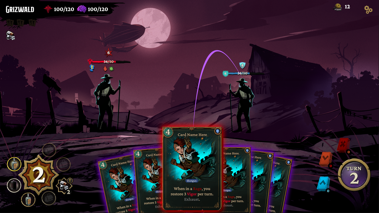
The revamped battlescreen, with all actionable items in the lower left, character data and relics in the top left, card decks and turn info in the bottom right, and options and income/resources on the top right.
Work Samples